Adding dependencies to standalone components

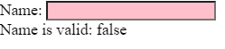
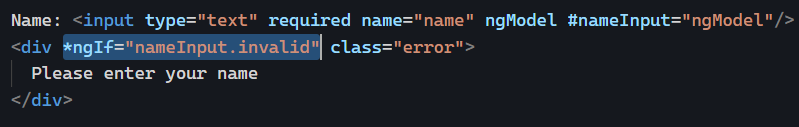
Now that we’ve introduced standalone components, you might have tested them and quickly realized that if you start using directives such as *ngIf, or other components, your code doesn’t compile anymore.

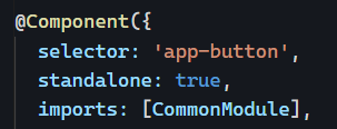
That’s because those template dependencies (used only in the HTML template of your component) are not imported in Typescript (yet), so Angular cannot compile your templates. This doesn’t happen when we use modules because our components are declared there. We also import CommonModule by default, which contains all of the primary directives and pipes of the Angular framework.

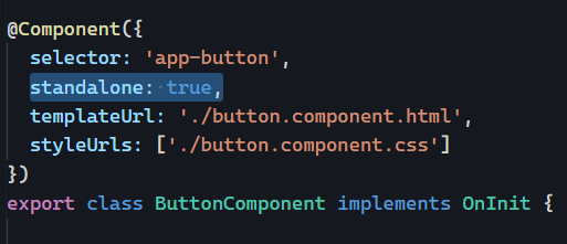
If we want to import all these features into our standalone components, we can use the import property in the decorator as follows:

And if you want to import just one feature instead of an entire module, you can do that too – but only if that feature is declared as standalone:

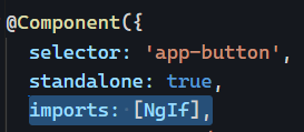
This means that the Angular team has modified all Angular directives and pipes to be available as standalone features (see the ngIf source code here as an example).

Of course, we can still import entire modules if needed or list individual template dependencies, which means that all pipes, directives, and components should be listed individually in the imports array:

You can see an example on Stackblitz here.

What are standalone components?

Since Angular 14, any Angular feature (component, pipe, or directive) can be created as “standalone.” This week, we will dive into what standalone components are, what feature they bring to the table, and how to use them.

One quick note before we start: Whenever you see the words “standalone components,” it really means “standalone components/pipes/directives.” Perhaps we should call those “standalone features,” but I’ll stick with the naming convention used by the Angular team so far, so I don’t stand… alone.

What’s a standalone component?

A standalone component is a component that doesn’t belong to any NgModule. It can be imported on its own and used as-is.

For instance, in the past, we might have a ButtonComponent and a ButtonDirective in a ButtonModule (just like Angular Material does). This means that if we want to use ButtonComponent, we have to import the ButtonModule in our AppModule or feature module. This will make both ButtonComponent and ButtonDirective available for use in our app, even if you just use one of those features and don’t need the other.

Standalone components are different. They can be imported in a module just like other modules get imported in the array of imports:

Importing only the features we need is always better for performance, as the build output will be smaller than if we import an entire module of dependencies. So that would be benefit number one of standalone components.

How to create a standalone component?

With the Angular CLI: ng generate component Button --standalone

We can also make an existing component standalone by adding the standalone: true property in the @Component decorator like so:

You can see that example in action here on Stackblitz.

RxJs debounceTime operator

This week’s RxJs operator is very commonly used for form validation: debounceTime.

debounceTime is going to delay emitted values for a given amount of time (in milliseconds) and emit the latest value after that period has passed without another source emission. I know it’s not super easy to describe with words.

A marble diagram for debounceTime looks like this:

In the above example, the values 2 – 3 – 4 – 5 are emitted less than ten milliseconds from one another, so they get dropped. Only five gets emitted 10 ms later.

Why is that useful for form validation? Because we usually want to wait for the user to finish typing something before triggering some asynchronous validation. For instance, if we validate a street name, it makes sense to wait for the user to stop typing for a while instead of sending HTTP requests to an API every time a new keystroke happens, which would flood the server with useless validation requests.

Using our credit card demo from yesterday, here is a different Stackblitz example where I debounce the output for 400 ms. This is the result:

You can see that the debounced value gets displayed once I stop typing for 400 ms. So that’s how I used that operator:

And then display the results side by side in my HTML template as follows:

Usually, 300 to 400 ms is an excellent spot to debounce user input, but you can try different values and see what works best.

If you want to dive deeper into asynchronous form validation, this tutorial should help: How to write async form validators with Angular?

Using validation functions that work with both template-driven and reactive forms

Yesterday, we looked at how to write a validation function that works with reactive forms. Template-driven forms have a somewhat similar approach that also uses a validator function but requires a wrapper directive that implements the Validator interface like this one (example here):

The easiest solution to write a validation function that works with both reactive forms and template-driven forms is to create a directive for the template-driven form validation and then expose the validation function as a static method of that class:

A static method has two advantages in that scenario:

  • It’s public
  • It does not require an instance of the class (we can refer to it as CreditCardValidator.validateCcNumber)

As a result, we’d use our validation feature like this in a template-driven form:

And like that in a reactive form:

You can check the complete code for that example on Stackblitz here. Here is another tutorial for more information on that validation approach.

Custom form validation functions

Let’s continue our dive into Angular form validation capabilities. So far, we have seen how to display custom feedback to the user based on basic HTML validation features. Today, let’s see how to customize the validation itself.

The good news is that all we need is a function. That function takes a FormControl as a parameter and returns null if the value entered by the user is valid. If the value is invalid, we return a ValidationErrors object, any key/value object we want.

Here’s an example:

Pretty straightforward, right? If the zip code is wrong, we return an object with a custom error message. Otherwise, we return null.

Of course, we can validate more precisely by adding several different checks and specific error messages for each case:

Then to have a specific input use that validation function, we can pass it as a parameter to the FormControl constructor like so:

And then such FormControl gets bound to the proper input in our HTML template (this is the approach for reactive forms – we will cover a method that works for template-driven forms tomorrow). We can then add some error handling by using the errors property of our FormControl, which is going to have the ValidationErrors object returned from our validation function:

Now our form provides custom feedback using our custom validation function:

You can access the code for the above example on Stackblitz.

Implementing custom feedback to form validation with Angular

Yesterday, we saw that Angular uses six different CSS classes (actually, eight – I didn’t mention ng-pending, which is the temporary state when async validation is being performed, and ng-submitted, which applies to the form element only).

Today, let’s see how we can customize the feedback displayed to the user beyond CSS classes. The nice thing about Angular validation properties is that they’re not just available as CSS classes. They are also available as public properties on the ngModel and the ngForm directives used in our form.

We can access such properties using template reference variables to access the exported values of these directives as follows:

The above code would result in the following rendering:

Of course, displaying true or false is not very user-friendly. Instead, we can use *ngIf and make the experience a little more polished:

Which looks like this:

We can apply the same idea to the form element and decide to disable the submit button as long as the form is invalid:

Or we could even hide the button as long as the form is invalid:

You get the idea. As simple as those validation properties are, they enable many possible different customizations of how we display validation feedback and hints to the user.

You can play with my code example on Stackblitz.

Basic form validation with Angular

Validating user input in HTML forms can be a tedious task. In this new series, we’ll look at how Angular can help us implement painless form validation.

First, it’s essential to know that Angular relies primarily on native browser validation features that use modern HTML properties. For instance, if a form field has to be filled out, you can mark it as required using the required HTML attribute:

If the user input has to match a specific format, you can specify such format using the pattern attribute, which uses a regular expression syntax – here, a 5-digit number

Other available HTML validation attributes are min, max, minlength, maxlength. You can also set the input type to something more specific than text, such as email or tel for additional validation and capabilities. Here is the list of all possible input types.

Once you have specified your validation rules using such attributes, Angular is going to toggle some CSS classes on the corresponding HTML elements automatically: ng-valid when the entered value is valid, and ng-invalid when the entered value is invalid.

This means that all we have to do to provide visual feedback to the user is implementing such classes in our CSS stylesheets:

The above CSS classes result in the following styling of form inputs:

If we want to fine-tune the rendering of our form based on whether the user has already typed something or not, there are additional classes added by Angular for such purposes:

  • ng-pristine: true when the user has not changed the element value
  • ng-dirty: opposite of pristine — true when the user has altered the element value
  • ng-touched: true when the user has put focus on the element (say clicked on it) and then removed the focus from the element (clicked away from it)
  • ng-untouched: Opposite of touched — means the user hasn’t put focus on the element or hasn’t removed that focus yet.

Using combinations of these classes is powerful. For instance, here is how we could add the error styles only once the user has “touched” an input:

Which results in the following default rendering:

And then once the user has typed something and removed the focus from the element:

You can try a few live examples using the code from this Stackblitz repo. Tomorrow, we’ll see how to do more than just CSS styling using those validation properties.

Using Stackblitz as an Angular playground

The easiest way to get an Angular development environment up and running these days is to use Stackblitz. I mention Stackblitz today because a few readers have sent me links to Github repos that they use when they want to test some of the ideas of this newsletter.

While Github is perfectly fine, creating a new project with Angular CLI, downloading all dependencies then committing to Github can take a few minutes each time, while Stackblitz gets you started in just 2 seconds. All you have to do is head to https://stackblitz.com/ and click the Angular button:

Stackblitz is excellent for a few more reasons:

  1. If you create your free account on Stackblitz, you can save your projects for later and share them with others with just one URL. One click on the URL and the app is up and running; no installation nor hosting is needed! Your friend can then fork your project if needed.
  2. Stackblitz can be used to import (and sync with) Github repos, too. The URL stackblitz.com/github/{GITHUB_USERNAME}/{REPO_NAME} can be used to access a public repo on Stackblitz. For instance: stackblitz.com/github/alcfeoh/ng-weather
  3. Stackblitz has an Angular CLI-like tool accessible with a right click called “Angular generator”:

You can also use it for full-stack projects using Node.js (and possibly JSON server covered earlier!), which makes Stackblitz even more powerful. And it’s 100% free!

RxJs distinctUntilChanged operator

This week, our RxJs operator of choice is distinctUntilChanged, another of these few operators with a name that is explicit enough.

distinctUntilChanged ignores unchanged values that get emitted several times:

This operator is beneficial when using RxJs to filter out data based on filters selected by the end user in the UI. For instance, it’s a way to ensure that we only trigger a data update (such as an HTTP request) when the filters have changed.

A notable feature is that you can pass a custom comparison function as a parameter to determine how to compare those values. Otherwise, the operator uses === as a default comparison, which is acceptable for basic types but not for comparing objects unless you want to compare references.

Creating a dialog in two lines of code

The theme of our week so far is that we don’t always need to think just in terms of components. We saw that directives and CSS selectors can be powerful tools to keep in mind.

Today, I’m going to show how modern HTML and template reference variables can do a lot of work for us with very little code.

Dialogs and modal windows have been a pain to work with for a very long time on the web. Not anymore though.

Here are a few lines of code that makes it all work painlessly:

dialog is a modern addition to HTML with a simple API: show(), showModal(), close(). The above code creates a template reference variable #dialog to get access to the dialog element, and then we call dialog.showModal() to open a modal window. That’s it. No dependency is needed, no CSS trick to create an overlay, no component library, and no jQuery.

Here is a link to a fully working example and a slighter longer tutorial with styling information for HTML dialogs.