routerLinkActive directive

Have you ever wondered how to highlight a specific HTML element, such as a link or a button, when a particular URL is selected? Something similar to this:

The good news is that there is a specific directive for this called routerLinkActive. Here is how you can use it:

The value set to routerLinkActive is the name of a CSS class (or several CSS classes) that gets applied to the HTML element when the current URL path matches the path of the routerLink directive on that same element. In other words, if the path is page1, then the button element has an active class applied to it.

As a result, all I did to style the above example was add that CSS class definition to my global CSS file:

And that’s it! Note that the directive supports several other options documented here:

You can see my example in action on Stackblitz here.

Directive Composition API

In the past few weeks, we’ve covered different examples of directives, such as the CDK Listbox directive and the CDK Drag and Drop directive. I have mentioned that directives are underused in Angular applications these days, and one way to use more directives is to adopt the directive composition API.

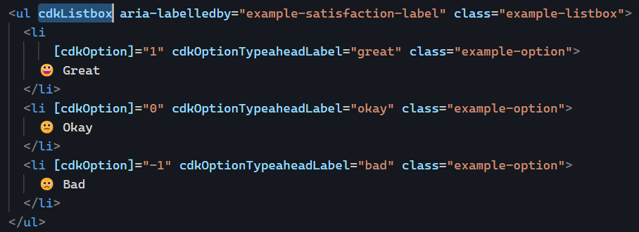
Let’s consider our previous example of a list of items:

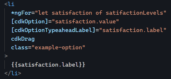
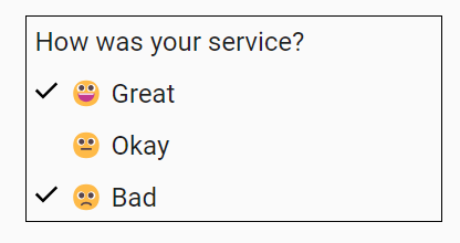
Let’s assume we want to make our list flexible enough to support re-ordering items using drag and drop. To do so, we could start using multiple different directives on the same element, such as cdkOption and cdkDrag (code example here on Stackblitz):

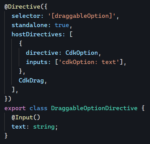
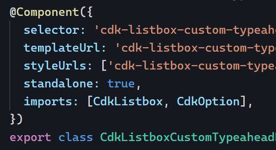
While the above code works, it’s designed for a one-time use case. If we know that our application will use several droplists that support drag-and-drop, we should start thinking about creating our own custom directive that refactors these different features in one place. Enter the directive composition API:

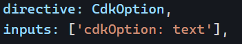
This new directive draggableOption is composed of both cdkOption and cdkDrag to achieve the desired result. We have one input text that is forwarded to the cdkOption input thanks to this syntax:

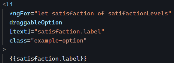
Note that both inputs and outputs can be forwarded that way (code examples here). The beauty of this approach is that our new directive has very little code while packing reusable features in a concise syntax. This is how we would use our new directive:

You can find that example live on Stackblitz here. There are a few caveats with the directive composition API, mainly that it only works with standalone directives and that the options to “forward” inputs and outputs are limited for now. However, the composition API is an excellent option to make our code more reusable and immune to copying and pasting collections of directives from one component to another.

Using the CDK ListBox for custom list selection

The Angular CDK is an important toolkit for building Angular applications. We’ve already covered how to display an overlay using the CDK. Today, let’s create a custom list selection feature using CDK ListBox.

Often, HTML dropdowns are too basic to allow for meaningful customization of what gets rendered in the dropdown. This has led to the creation of several custom components, such as Material Select.

But what if you’re not using a library and still need to customize a list of items for your users? Something like this, for instance:

Implementing such a UI with HTML is not very difficult. The complexity of the task comes from getting all the expected behaviors for an accessible experience, such as keyboard interaction and focus management.

This is where the cdkListbox directive shines. Here’s an example:

The few lines of code in this example add the following select-dropdown-like features to these basic HTML list items:

  • A numerical value is associated with the user selection (1, 0, or -1) thanks to cdkOption
  • Typeahead is available. If I click on the list and then type “o” on my keyboard, the “Okay” option gets selected.
  • The current selection can be changed using the keyboard’s up and down keys.

And there are many more possibilities to explore. For instance, enabling multiple selections in the list is as easy as adding a cdkListboxMultiple attribute on our list element:

And now I can do this:

You can see that example in action on Stackblitz here. Another nice feature of the Angular CDK is that all its directives are standalone, so we can import just what we need in our components:

Angular 16.2: NgComponentOutlet input bindings

Another feature of Angular 16.2 is using input bindings with component outlets. You might not be familiar with ngComponentOutlet in the first place, so let’s explain what the directive does.

Let’s consider the following template syntax:

The above code would load a dynamic component into the ng-container. Assigning a new component type to componentTypeExpression would display it in that container. Here’s a basic example that shows a HelloComponent in the component outlet:

This can be helpful if you need to use different types of components and don’t want to (or can’t) use the router to make it happen.

The new feature of Angular 16.2 allows us to pass input values to that component. Let’s assume that HelloComponent looks like this:

We can bind a value to the name input as follows:

And that does the trick! You can see an example in action on Stackblitz here. inputs is an object that can have as many keys as needed. In my example, there is only one: name.

Using setters with @Input()

Following our theme of lifecycle methods with ngOnChanges and ngOnInit, I want to give you another interesting trick to be notified when an @Input value changes.

We’re already familiar with that syntax:

But what if instead of applying @Input on a class property, we used it on a setter:

The input works the same as before, with the advantage of running several instructions when a new value is set. All of that without using ngOnChanges. This approach is practical if you have several side-effects to trigger depending on which input changes, which would be tedious to handle with multiple conditionals:

The setter approach brings more clarity and leaves less room for mistakes:

ngSwitch directive

The ngSwitch directive is a good alternative to ngIf if you have to handle more than two scenarios.

It works similarly to a switch statement in traditional programming languages, allowing you to define a set of cases and associate each case with a specific template block to be rendered. For instance:

One of my favorite use cases is for basic pagination in a component (or an image carousel, for instance) where clicking on navigation buttons changes a value that triggers a different “case”:

Clicking on the buttons changes the value of page and displays a different template. Applying this to components instead of HTML elements is especially powerful. For instance: <app-hello *ngSwitchCase="3"></app-hello>

You can see an example in action on Stackblitz here.

How to create custom directives?

I’ve touched on when it makes sense to create custom directives , how to use bindings in directives, and how to get creative with Angular selectors.

Today, let’s tackle how to create custom directives. The first thing to do is to use the Angular CLI:

ng generate directive [name]

or ng g d [name]

It’s also possible to generate standalone directives with the --standalone option:

ng generate directive [name] --standalone

Once you’ve done that, you end up with an empty class to implement:

At that point, it’s important to remember that a directive is just like a component. The only difference is that a directive doesn’t have an HTML template. As a result, we can still use @Input(), @Output(), and all sorts of bindings and listeners.

As a result, your directive will manipulate HTML attributes and events on its host element. Here is a typical example of a custom directive that sets a credit card logo image based on a credit card number:

Its source code looks like this:

As you can see, we use an @Input() to receive the cardNumber and a host binding to change the value of the src attribute. You can find a step-by-step tutorial that explains the above code in more detail here.

Combining multiple Observables with ngrxLet

Last month, I explained how to use ngrxLet to render a loading template. Earlier this year, I also covered how ngrxLet can be a great alternative to the async pipe. All in all, ngrxLet is a fantastic directive that keeps improving.

For instance, we can also use it to combine multiple different Observables into one local variable as follows:

Without ngrxLet, the equivalent code would have to use the async pipe syntax trick covered last week:

This also works, but it’s more verbose and has the downside of using ngIf, which is present only because we need a structural directive to enable the local variable assignment micro-syntax.

ng-class for dynamic styling

This is a guest post by Tomas Kotlar. Thanks for your contribution, Tomas! Remember than anyone can reach out to me to contribute or suggest post ideas.

ngClass, as defined by the Angular documentation, is a built-in attribute directive that dynamically modifies the behavior of other HTML elements.

Common use cases

Conditional Styling

Let’s consider a button element that changes color based on whether it’s disabled or active. We can use ngClass to toggle between the ‘active-btn’ and ‘disabled-btn’ classes, giving the button a responsive touch:

Whenever the button is clicked, the toggleDisabled() function will be executed, toggling the value of isDisabled.

As a result, the button will become enabled or disabled based on the updated value of isDisabled, and the corresponding style (active or disabled) will be applied.

Using an Object

ngClass goes beyond just toggling classes. It also lets you iterate over object properties to apply your styles conditionally. This can be handy when working with data-driven apps or displaying dynamic content.

For example, using the following data:

In our HTML, we can apply dynamic styles using an array:

Based on the type (‘hero’ or ‘villain’), the directive applies the appropriate highlight class to the hero card.

Combining classes using conditions

With ngClass, you can mix multiple CSS classes, toggling them individually or creating compound styles:

The hero cards will be highlighted for heroes who can fly and have a different style for heroes who cannot, based on the canFly property.

ngFor trackBy for improved performance

We all use the ngFor directive on a daily basis. The directive is used to repeat a template as many times as needed based on an array of data we want to render. We covered how the directive exposes useful local variables in the past.

To help Angular perform DOM updates when items in the array are reordered, new items are added, or existing items are removed, we can add a trackBy attribute that specifies what unicity criteria Angular will use to track these additions/removals/reorderings:

Of course, this only helps if the array in question is subject to changes in the future. By default, Angular uses Object.is() to compare values in the array, which is somewhat similar to a === comparison.

In our case, we created a function that specifies how to track by _id:

That way, Angular will know how to compare objects efficiently and won’t perform DOM updates that aren’t needed, which can be a huge performance boost if you’re displaying a massive data table with thousands of records. You can see this example in action on Stackblitz here.