Following our theme of lifecycle methods with ngOnChanges and ngOnInit, I want to give you another interesting trick to be notified when an @Input value changes.
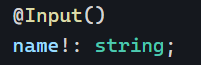
We’re already familiar with that syntax:
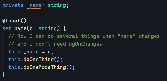
But what if instead of applying @Input on a class property, we used it on a setter:
The input works the same as before, with the advantage of running several instructions when a new value is set. All of that without using ngOnChanges. This approach is practical if you have several side-effects to trigger depending on which input changes, which would be tedious to handle with multiple conditionals:
The setter approach brings more clarity and leaves less room for mistakes:
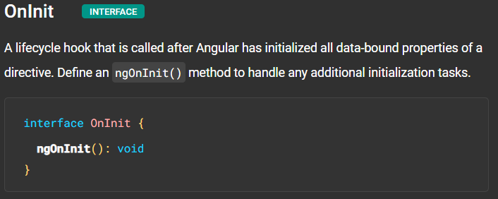
A few days ago, we talked about the ngOnChanges lifecycle hook. We saw that every time an @Input() changes, Angular will trigger ngOnChanges. ngOnInit is similar but runs only once; after all @Input() receive their initial value. The official documentation puts it like this:
The above definition might surprise you because there is a widespread belief that the purpose of ngOnInit is to run all initialization tasks, even though the class constructor runs before ngOnInit, as explained a few months ago in this entry: ngOnInit vs. constructor in Angular.
As a result, using ngOnInit is only 100% justified when you want to run some code that needs the value(s) of @Input() properties of your component/directive. In other scenarios, you can use a constructor to run your initialization code sooner.
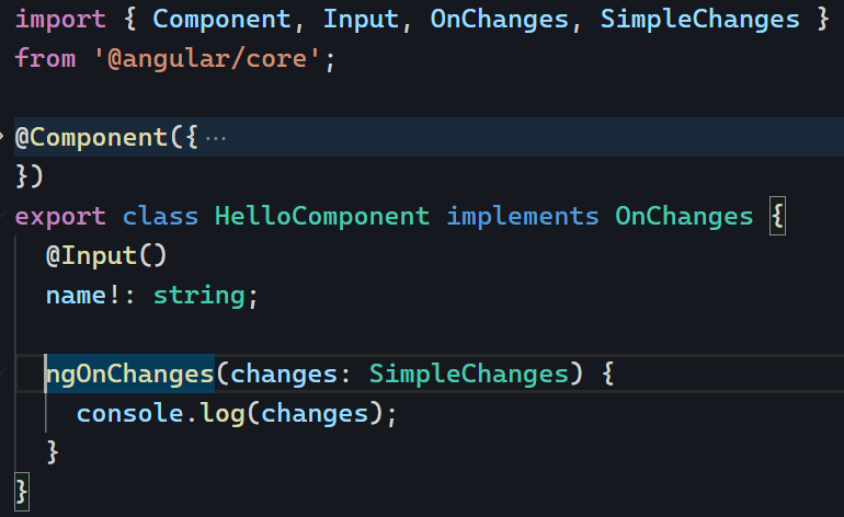
ngOnChanges is an Angular lifecycle hook that is called whenever one or more of the bound input properties of a component changes. This hook helps update the component’s state or view in response to changes to the input properties.
To use it, implement the OnChanges interface as follows:
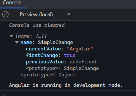
The above ngOnChanges method will run every time the parent component updates the value of name. We can get more information about what changed using the parameter of that method, an object that maps each changed property name to an SimpleChange object. The SimpleChange object contains the following properties:
previousValue: The value of the property before it changed.
currentValue: The value of the property after it changed.
firstChange: boolean value, true if it’s the first change made to that input, false otherwise.
As an example, the above code would output that object to the console as follows:
You can find that example in action on Stackblitz. The most common real-life example of using ngOnChanges is to be notified when an object ID changes so the component can request data for that ID using a service that makes an HTTP request, for instance.
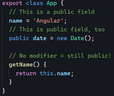
Angular is mostly about Typescript classes, and Typescript classes have modifiers that alter the visibility of class members: public, protected, private, and readonly. Here is what you need to know about them.
Everything is public by default
If you don’t use a modifier on a class member, it is public by default. Any other class can see and use that member and change its value:
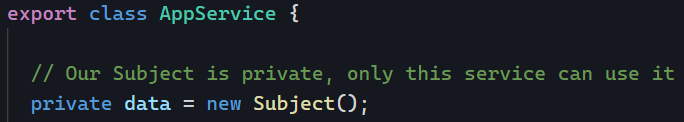
private means that the member isn’t visible outside of the class (including a component’s HTML template)
private is a way to enforce that other classes cannot access a member of your class. Used in a component, this indicates that we do not want that property to be used in the component’s HTML template. In a service, this suggests that we don’t want other components/services to see that member:
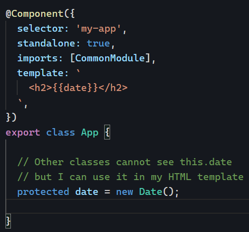
protected is in-between public and private. It makes the member accessible in a component’s template without making it fully public.
In the following example, our component property date is invisible from other Angular code in our app, but our HTML template can use it:
Best practice – My recommendation
If you want to stick to simple rules that make sense and are the safest, here’s what you can do:
Make every member private by default
If the member is needed in the template of a component, make it protected
If the member is meant to be fully public, go with public
Tomorrow, I’ll add a couple more suggestions by introducing the readonly modifier. Stay tuned!
When working with lots of forms, you’ll likely use similar controls repeatedly: A country selection dropdown, a state selection dropdown, a date-range picker with specific constraints, etc.
Instead of duplicating our code, which is never a good idea, Angular allows us to create custom form controls that integrate with Angular’s form validation mechanism.
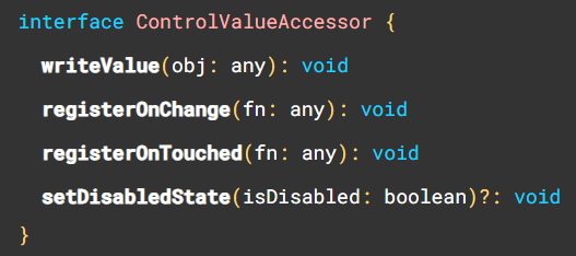
This feature requires our custom control component to implement an interface called ControlValueAccessor that has the following methods:
It’s also worth noting that you don’t have to start from scratch when implementing a control value accessor. Angular has a DefaultValueAccessor directive (the one used by FormControl, NgModel, etc., in Angular forms) that can be invoked with the selector ngDefaultControl, and there are a few more options available, such as the SelectControlValueAccessor.
This is a guest post by Tomas Kotlar. Thanks for your contribution, Tomas! Remember than anyone can reach out to me to contribute or suggest post ideas.
ngClass, as defined by the Angular documentation, is a built-in attribute directive that dynamically modifies the behavior of other HTML elements.
Common use cases
Conditional Styling
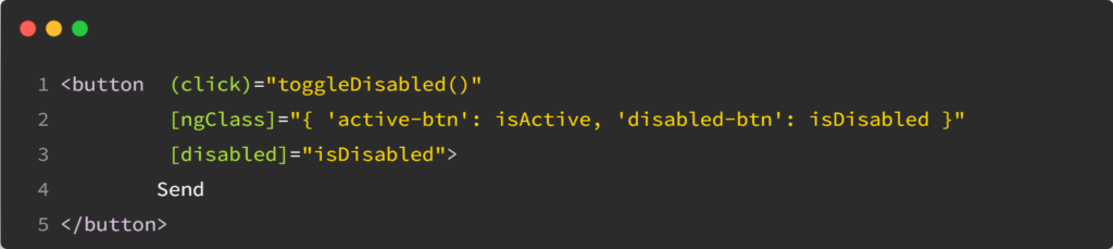
Let’s consider a button element that changes color based on whether it’s disabled or active. We can use ngClass to toggle between the ‘active-btn’ and ‘disabled-btn’ classes, giving the button a responsive touch:
Whenever the button is clicked, the toggleDisabled() function will be executed, toggling the value of isDisabled.
As a result, the button will become enabled or disabled based on the updated value of isDisabled, and the corresponding style (active or disabled) will be applied.
Using an Object
ngClass goes beyond just toggling classes. It also lets you iterate over object properties to apply your styles conditionally. This can be handy when working with data-driven apps or displaying dynamic content.
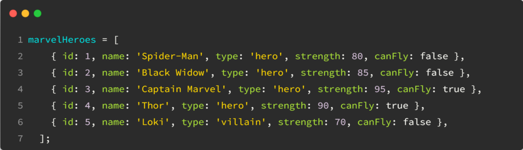
For example, using the following data:
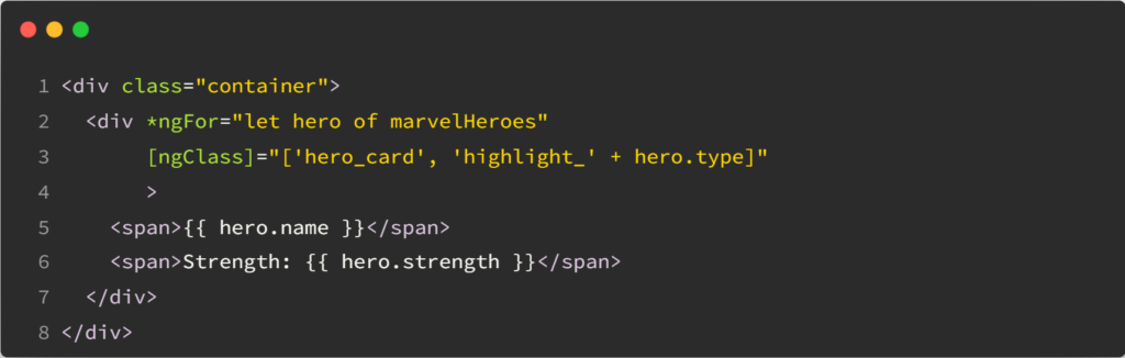
In our HTML, we can apply dynamic styles using an array:
Based on the type (‘hero’ or ‘villain’), the directive applies the appropriate highlight class to the hero card.
Combining classes using conditions
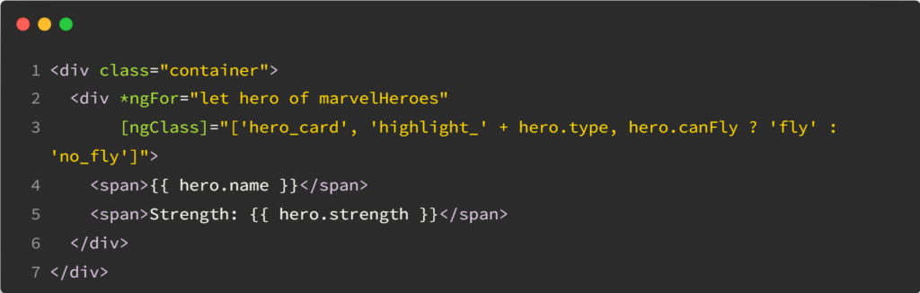
With ngClass, you can mix multiple CSS classes, toggling them individually or creating compound styles:
The hero cards will be highlighted for heroes who can fly and have a different style for heroes who cannot, based on the canFly property.
Yesterday, we covered ng-template and touched on different scenarios when it makes sense to use ng-template. Let’s now introduce a close relative of ng-template called ng-container.
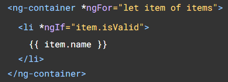
There are a lot of similarities between those two elements, which can both be used to use structural directives such as ngIf or ngFor, with the bonus that ng-container can be used with the shorthand syntax of those directives:
One thing you probably noticed as an Angular developer is that we can’t use two structural directives on the same element:
In this scenario, using ng-container is the perfect way to use both directives without adding any HTML to the DOM, as ng-container, just like ng-template, doesn’t create new DOM elements:
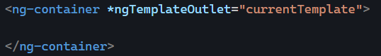
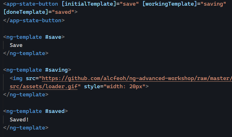
Another use for ng-container is to become the host of a ng-template, similar to the way that a router-outlet is the host of routed components:
Such templates can be passed from a parent component using @Input and let the child component decide when to display which template, which is very powerful:
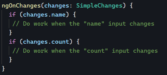
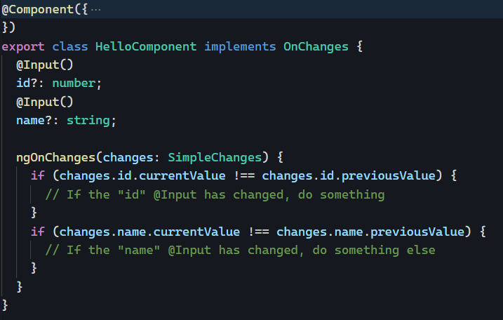
When using @Input in our components, we can implement ngOnChanges to be notified whenever an input value has changed:
The above code works and would run whenever id or name are updated by the parent component. The problem is that this syntax can quickly become heavy when there are several @Inputs in your component.
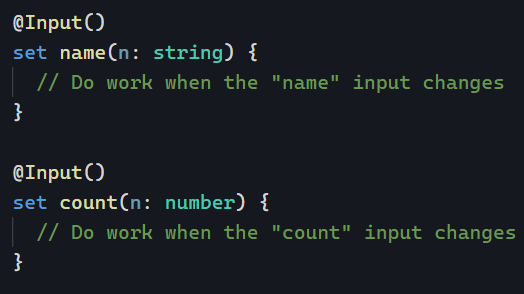
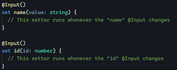
Instead, we can do this:
Instead of using @Input() on a class property, we can use it on an ES6 setter function. The benefit of the setter syntax is that it makes it obvious what kind of code we’re running when the @Input value is set. No more ngOnChanges needed.
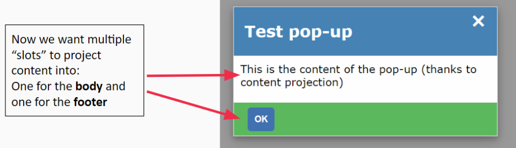
Yesterday, we saw that we could use content projection to pass an HTML template from one component to another. But what if we want to pass multiple different templates? We can use multi-slot content projection.
Here’s what we want to achieve:
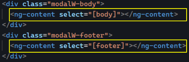
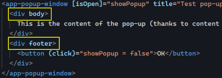
In our reusable dialog component, we will have multiple ng-content elements. Each ng-content will have a specific query selecting a template to render:
These queries use the CSS selector syntax. In the above example, we’re using [], which means we are selecting HTML attribute names. As a result, our parent component will pass two distinct templates, one for the body and one for the footer, using the following syntax: